Home Gallery Walls: Complete Setup Guide (Room by Room)
Transform blank walls into a personal museum with this comprehensive gallery wall guide. From planning layouts (grid, salon, linear) to spacing rules, height guidelines, and step-by-step installation, learn everything you need to create a gallery wall that looks intentional—not accidental.
By Austin Gallery
This article contains affiliate links. Austin Gallery may earn a commission at no cost to you.
Creating a gallery wall is one of the most rewarding home design projects you can take on. It turns a blank stretch of drywall into a curated visual statement that reflects your taste, your history, and the things you care about. The best part is that you do not need professional help to do it well. You need a plan, the right hardware, a few hours on a weekend, and a willingness to step back, look, and adjust. This guide covers every stage of the process, from selecting the right wall in your home to seasonal rotation strategies that keep the display feeling fresh for years. We use these same techniques when installing client artwork at Austin Gallery, and they work just as reliably in a living room as they do in a gallery space.
Not every wall in your home is a good candidate for a gallery display. The ideal gallery wall has a few characteristics that make it easier to work with and more impactful once finished.
Look for a wall that is at least six feet wide and has clear sightlines from the main entry point of the room. The wall behind a sofa, the area flanking a fireplace, a hallway that connects living spaces, and the wall opposite your front door are all strong candidates. Avoid walls that are interrupted by too many doors, windows, or switches. A gallery wall needs breathing room. If you have to route your layout around a light switch plate or thermostat, the result will always look compromised.
Lighting Conditions
Natural light is your best friend, but direct sunlight is your enemy. Prolonged UV exposure fades pigments, yellows paper, and degrades canvas over time. A wall that receives diffused northern light or ambient light from a nearby window is ideal. If your chosen wall sits in a dim hallway or a room with limited windows, plan to supplement with picture lights or track lighting. Our complete art lighting guide covers the best options at every price point.
Wall Construction
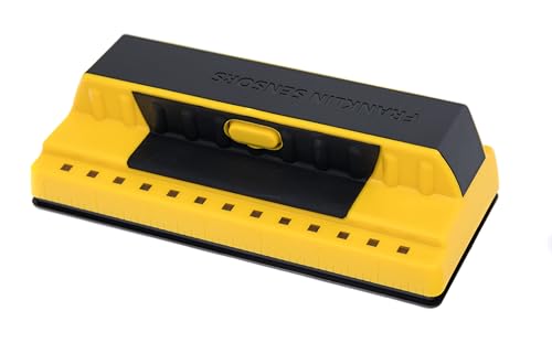
Before you commit, figure out what your wall is made of. Most interior walls in homes built after 1950 are standard drywall over wood or metal studs. You can hang moderate weight (up to 30 pounds per anchor point) directly into drywall with quality picture hangers, and significantly more if you hit a stud. Use a Zircon StudSensor e50 Electronic Wall Scanner to locate studs before you start. Knowing where the studs are gives you options for heavier pieces and lets you plan your layout around the strongest hanging points. If your home has plaster walls, lath-and-plaster, or concrete behind the surface, you will need different fasteners and possibly a masonry bit. Always test a small area first.
Most interior walls in homes built after 1950 are standard drywall over wood or metal studs.
The planning phase is where good gallery walls separate themselves from mediocre ones. Rushing this step is the single most common reason people end up with extra holes, uneven spacing, and a result that never quite looks right.
Gather Your Collection First
Before you think about arrangement, pull together every piece you are considering for the wall. Lay them all out on the floor in front of the target wall. Include frames you already own, unframed prints or canvases you have been meaning to hang, and any non-art items you might want to incorporate (more on that later). Seeing everything at once helps you evaluate the collection as a whole rather than making piecemeal decisions.
The Paper Template Method
This is the gold standard technique used by professional art installers, and it is the method we recommend to every client at Austin Gallery. It eliminates guesswork entirely.
Lay each framed piece face-down on kraft paper, butcher paper, or even newspaper. Trace the outline with a marker and cut it out.
On each paper cutout, mark the exact point where the hanging wire or bracket meets the wall when the frame is held in position. This is your nail point. To find it, hold the frame against the wall, pull the wire taut with a finger, and measure from the top of the frame down to the wire. Transfer that measurement to your paper template.
Arrange all the paper cutouts on your wall using painter's tape. Use low-tack tape so it will not pull off paint when you remove it.
Step back to the main viewing position in the room and evaluate the arrangement. Live with it for at least a few hours, ideally overnight. You will notice things from across the room that you miss up close.
Once you are satisfied, drive your nail or hook directly through the marked point on each paper template. Tear the paper away and hang the frame.
This method costs you nothing but time and a roll of kraft paper. It lets you see the exact footprint of every piece on the wall, experiment with arrangements without putting a single hole in the drywall, and verify that your spacing is consistent before you commit. For an in-depth look at our recommended hanging tools and techniques, read our professional art hanging tools guide.
Digital Planning Tools
If you want to brainstorm before committing to paper templates, apps like iArtView allow you to photograph your wall and superimpose images of your artwork at scale using augmented reality. Canva works well for creating scaled digital mockups if you know your precise wall and frame dimensions. These digital tools are excellent for early-stage exploration, but they lack the tactile accuracy of paper templates for final placement. Use them as a complement, not a replacement.
Layout Styles
The arrangement you choose should reflect both the character of your collection and the architectural personality of the room. Here are the most popular approaches, with guidance on when each one works best.
Grid Layout
A grid is the most structured option: frames of identical (or very similar) size hung in precise rows and columns with equal spacing throughout. This works beautifully with a photographic series, a set of matching botanical prints, or any collection where uniformity is the point. Grid arrangements demand precision. Every frame must be the same size, every gap must be identical, and every row must be perfectly level. A Bosch GLL 30 Self-Leveling Cross-Line Laser Level is invaluable here. It projects perfectly horizontal and vertical reference lines onto your wall, which makes aligning a 12-frame grid dramatically easier than working with a tape measure and a bubble level.
Grid layouts pair well with modern, minimalist interiors where clean lines are already a defining feature. If your space leans traditional or eclectic, a grid can feel rigid.
Salon Style
The salon hang is the classic European gallery approach: frames of varying sizes, orientations, and styles clustered together in an organic but intentional arrangement. Named after the floor-to-ceiling displays in 18th-century Parisian salons, this style is the most forgiving because the variety itself creates visual interest. Small imperfections in spacing are absorbed by the overall composition.
To execute a salon-style wall, imagine an invisible boundary shape, typically a rectangle, and fill it with your pieces. Keep your inter-frame spacing consistent (2 to 3 inches is the standard range), and make sure the outer edges of the grouping form a roughly clean perimeter even if the interior is varied. Start by placing your largest or most visually dominant piece slightly off-center, then build outward, alternating sizes and orientations. The Apartment Therapy gallery wall guide has excellent examples of salon-style layouts in real homes.
Salon style is ideal for inherited collections, estate art, and accumulations that were never intended to match. It celebrates variety rather than fighting it.
Staircase Layout
A staircase gallery wall follows the ascending or descending line of a stairway, with frames arranged in a diagonal progression that mirrors the angle of the stairs. The key is to maintain a consistent distance between the bottom edge of each frame and the stair treads (or the stair rail), and to keep the diagonal line of the arrangement parallel to the slope of the stairs.
Measure the angle of your staircase with a level and a protractor, or simply run a length of painter's tape along the wall parallel to the handrail and use it as your guide line. Staircase walls tend to work best with a salon-style interior arrangement along that diagonal axis. Rigid grids fight the angle and look awkward.
Shelf and Ledge Display
If you want flexibility without committing to nail holes, picture ledges (narrow shelves with a front lip) let you lean frames against the wall and rearrange them at will. This is an excellent option for renters, for people who rotate art frequently, or for spaces where you want to layer frames in front of one another for depth. Install ledges at 57 inches to the center of the shelf for a single row, or stagger two or three ledges at different heights for a more dynamic display.
Professional galleries and museums follow specific standards that have been refined over decades. You do not need to be rigid about them in a home setting, but they provide an excellent starting framework.
The 57-Inch Rule
The standard center-hang height used by most major museums, including the Museum of Modern Art and the National Gallery of Art, is 57 inches from the floor to the center of the artwork. This places the visual center at average standing eye level and creates consistency across a room. For a single statement piece, 57 inches is nearly always correct. For a gallery wall grouping, the center of the overall composition should sit at approximately 57 inches.
Austin Art Insider
Free weekly guide to galleries, exhibitions & collecting in Austin.
Adjust for context. If the art hangs above a sofa, leave 6 to 8 inches between the top of the sofa back and the bottom of the lowest frame. If your ceilings are 10 feet or taller, you can shift the center height up to 60 inches. The critical principle is consistency: pick a center height and apply it across the room.
Spacing Between Frames
The standard inter-frame gap in professional gallery settings is 2 to 3 inches. Here is how to calibrate based on frame size:
Small frames (under 16 inches): 1.5 to 2 inches between frames
Medium frames (16 to 30 inches): 2 to 3 inches between frames
Large frames (over 30 inches): 3 to 4 inches between frames
Mixed sizes: Use 2.5 inches as your constant and adjust only when a gap looks optically uneven
Consistency matters more than the exact number. If you choose 2.5 inches, use 2.5 inches everywhere.
Frame Selection: Consistency vs. Eclectic Mix
This is one of the most common questions we hear at Austin Gallery, and the answer depends on the look you are after.
Matching Frames
Identical frames in the same finish create a cohesive, polished, gallery-like appearance. This approach works best with grid layouts, photographic series, or any arrangement where you want the art to be the variable and the framing to be the constant. Black frames with white mats are the most universally reliable combination and the one used in most contemporary gallery settings. For a deeper understanding of frame styles, mat options, and glass choices, see our art framing masterclass.
Mixed Frames
An eclectic mix of frame styles, finishes, and widths creates a collected-over-time look that feels personal and lived-in. This works naturally with salon-style arrangements and with inherited collections where the frames are part of the history. To keep a mixed-frame wall from looking chaotic, limit your palette to two or three finish families (for example, black, natural wood, and gold) and distribute them evenly across the arrangement so no single finish clusters in one area.
No Frames at All
Canvas wraps, metal prints, and unframed works on panel need no frame and can be mixed into a gallery wall for textural variety. Combining framed and unframed pieces adds visual depth and keeps the display from feeling formulaic.
The hardware you use matters more than most people realize. The wrong hanger leads to frames that drift, tilt, or fall. The right hardware is invisible and holds for years.
For Lightweight to Medium Pieces (Under 30 Pounds)
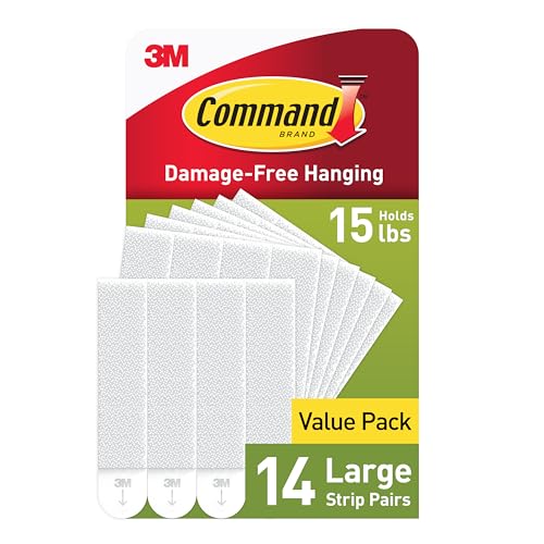
OOK Professional Picture Hanging Hooks are the standard choice among professional installers. They use hardened steel nails driven at an angle into drywall and hold significantly more weight than generic hardware store hangers. They leave a small nail hole that is easy to patch and are rated for up to 100 pounds depending on the model in the kit. For renters or anyone who wants zero wall damage, Command Picture Hanging Strips use adhesive to hold frames up to 16 pounds each and remove cleanly without pulling off paint. They are best suited for lighter frames and work well on smooth, clean surfaces.
Large oil paintings, heavy mirrors, and oversized framed works need more than a single nail. A French Cleat Hanger Kit distributes weight across a wide mounting bar secured to wall studs, and the interlocking cleat design makes it easy to level the piece after installation. French cleats are the industry standard for anything over 30 pounds and for pieces that are too valuable to risk on a single hook.
Once your frames are hung, apply clear rubber bumpers to the bottom two corners of the back of each frame. These small adhesive pads grip the wall surface and prevent frames from tilting or shifting when people walk past or when doors close nearby. They also protect the wall from scuff marks. This is a small detail that makes a meaningful difference, and it is standard practice in every professional installation we do.
A gallery wall that includes only one size of frame or one type of art can feel monotonous. The most visually engaging displays mix dimensions, mediums, and visual weight.
Size Variation
Include at least one large anchor piece (24 by 36 inches or bigger), several medium works (11 by 14 to 16 by 20), and a handful of small pieces (8 by 10 or smaller). The large piece grounds the composition and gives the eye a resting point. Smaller pieces fill gaps and create rhythm. Place your anchor piece first, slightly off-center from the mathematical middle of the wall, and build outward from there.
Medium Variation
Combine photography, painting, drawing, prints, and textiles. A charcoal sketch next to an oil painting next to a vintage photograph creates textural richness that a wall of identical prints cannot achieve. The Architectural Digest guide to mixing art mediums provides strong examples of cross-medium gallery walls in designed interiors.
Incorporating Non-Art Items
Some of the most compelling gallery walls include objects that are not art at all. These additions break up the visual rhythm of rectangular frames and add three-dimensional depth.
Mirrors
A small decorative mirror placed within a gallery wall grouping reflects light back into the room and creates the illusion of more space. Use mirrors sparingly, one or two maximum, and choose frames that complement the surrounding artwork.
Small Shelves
A narrow floating shelf within the grouping can hold a small plant, a sculptural object, a candle, or a stack of small books. This adds a layer of depth that flat frames alone cannot provide. The shelf becomes a display within the display.
Plants
A trailing plant in a wall-mounted planter or a small shelf-top plant brings organic texture and color into the composition. Choose low-maintenance varieties like pothos, string of pearls, or air plants that do not require frequent watering near your artwork.
Decorative Objects
Woven baskets, ceramic plates, vintage letters, small clocks, and textile pieces can all be integrated into a gallery wall. The Emily Henderson studio blog frequently features gallery walls that mix functional and decorative objects with framed art, and her layouts are excellent references for this approach.
Color Coordination
A gallery wall does not need a strict color palette, but having some awareness of color relationships prevents the arrangement from feeling random.
Pull Colors from the Room
Look at your furniture upholstery, rug, throw pillows, and curtains. If your living room has a neutral base with blue accents, lean toward artwork that includes some blue tones. This does not mean every piece must feature the same color, but having a thread of shared hues ties the gallery wall into the larger room.
Use Mats and Frames as Color Bridges
If your art collection is chromatically diverse, unify the display through consistent mat color (white or off-white mats are the safest choice) and a limited frame palette. The frames and mats act as a visual border that ties disparate images together. The Smithsonian's guidelines on framing and display offer detailed recommendations on how mat and frame choices affect the visual cohesion of a display.
The Smithsonian's guidelines on framing and display offer detailed recommendations on how mat and frame choices affect the visual cohesion of a display.
A gallery wall is not a permanent installation. It should evolve as your collection grows and your taste changes.
Regular Maintenance
Dust frames monthly with a microfiber cloth. Check hanging hardware every six months to ensure nothing has loosened, especially in older homes where walls settle over time. Straighten frames as needed and replace rubber bumpers if they lose their grip.
Seasonal Rotation
Rotating artwork seasonally keeps your space feeling fresh without requiring you to buy new pieces. Swap in lighter, brighter works for spring and summer. Bring in warmer tones and richer textures for fall and winter. If you have more art than wall space (most collectors do), store off-rotation pieces properly in a cool, dry space away from direct light. This rotation habit also reduces UV exposure on any single piece by limiting the time it spends on the wall.
Adding New Pieces
When you acquire a new work, resist the urge to just squeeze it in wherever there is space. Take the time to re-evaluate the entire arrangement. Sometimes a new piece works best as a replacement for an existing one rather than an addition. The paper template method works just as well for rearranging as it does for initial installation. Pull everything down, lay out templates, and rehang with fresh eyes.
When to Call a Professional
If you are working with very heavy pieces (over 50 pounds), valuable original artwork, antique frames, or walls that are plaster, brick, or concrete, consider hiring a professional art installer. The cost is modest relative to the value of what you are hanging, and a professional will ensure the hardware, weight distribution, and environmental conditions are correct. At Austin Gallery, we offer installation guidance for clients and can recommend trusted local installers in the Austin area.
Start Simple and Build Over Time
You do not need to fill your wall in a single weekend. Some of the best gallery walls are built over months or even years, with new pieces added as they are discovered. Start with three to five pieces that you love, arrange them well, and leave room to grow. The empty space is not a flaw. It is an invitation. Every estate collection, every gallery exhibition, and every museum wing started with a single piece on a wall. Yours can too.
For more gallery wall inspiration and practical advice, browse the curated collections at Austin Gallery or explore our gallery wall tools and tips guide for additional product recommendations and technique breakdowns.
The Hanging Toolkit
The specific products we keep coming back to. Each link is affiliate — clicking through and buying supports the work we do here at no cost to you.